New Brand Identity!
Big news! Today, after fifteen years, the GGAFL is releasing an updated brand identity! This included new logos and messaging. You’ll see the new look (and messaging) everywhere we’re out in public, like our website, Facebook, and Instagram; and in the coming days a range of new team-wear and merchandise! We believe the new look better matches what we’ve become since 2002: a community of supporters and amateur athletes, united by our love of Aussie footy in the San Francisco Bay Area.
Since our founding in 2002, the GGAFL has stuck with the same red-white-blue jumping man logo, the Roos have had several iterations of their own; all the while women's footy has emerged hard and fast under the GGAFL banner! While we continue to have incredible success on the field, our multiple programs (GGAFL, Roos/Maidens, Metro comp, SF Footy etc.), each with their own brand identity, has caused confusion for new players and a disconnect with potential sponsors. The multiple identity dilutes our brand as one organization, weakening our brand and reach beyond the Bay Area. Needless to say, it is time for a change.
To that end, we are rolling out a new GGAFL logo, evolved Maidens and Roos logos, and more thoughtful messaging to unify us, grow our brand and ultimately make footy stronger in the Bay Area. A huge thank you to Adam Linke who volunteers countless hours to wrangle the design brief, liaising with our awesome graphic designers Riccardo Leumann & Nadia Rayward. For more details on our design process and decisions, please check out this article here. We hope you like this new look and feel for the GGAFL, Iron Maidens and Roos! The first team-wear products to be ready and available this week at Oak and SF training. For supports, merch will be available to buy soon. - Julie Marks
Messaging
Let's start with the messaging. First, we're not renaming anything. There's still the Golden Gate Roos, San Francisco Iron Maidens and the umbrella organization that is the GGAFL. The teams have established their own strong identity and we aren't about to mess with it. Instead, we decided to unite the programs visually - more on that below.
When it comes to messaging, you may notice that when possible, we will use our new (and visually united!) Roos and Maidens logos to represent us, over the new GGAFL logo. This is because we feel our two major teams have much stronger brand identities and in turn this generates more excitement and support. Put another way, we should be promoting our awesome teams, not the administrative body they belong to.
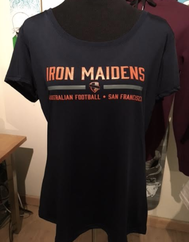
We love that the 'Golden Gate' of the GGAFL and GG Roos represents the entire Bay Area, both by name and function. But we have also seen the impact clubs can have beyond their local region when they are strongly affiliated with a well known US city. This grounds us to somewhere relatable to people, especially those outside the USA. To that end, you may notice slogans or messaging emphasizing our affiliation to 'San Francisco'. For example, when we use the GGAFL logo it will often be accompanied by text such as "Australian Football - San Francisco". As members of this community, we know that this means the entire San Francisco Bay Area - but for folks beyond California we want our brand's location to be just as quickly and easily recognizable. We feel "San Francisco" by itself achieves this, while being succinct and aesthetically pleasing in terms of design.
Logos + Colors
Our design goal was to better unify the three programs (GGAFL, Roos, Maidens), while holding onto the elements we already know and identity with. A small team inside the GGAFL worked to find something that appeared crisp, strong, powerful and ultimately connected. In the end, it was decided that all three logos would be built on an abstract shield shape, that carries a dominate text title above the program icon. We feel the shape and colors united the logos, while the text and icon allow the viewer to clearly differentiate between them. Inspiration was drawn from the new Melbourne Demons and Eastern Region Women's Football League logos.
|
GGAFL
After a great career, the jumping man will hang up his boots. It will be replaced by a new logo that was designed in unison with the evolved Roos and Maidens logos. The logo adopts our major team colors; deep dark navy background with a fierce fiery orange over top. The simple yet symbolic Golden Gate Bridge icon spans across the shield. Obviously, this represents the league's name and is a fitting visual element given it's used on both the Iron Maidens and Roos jumpers. While it was tried, no footy icons or goal posts were included as it looked tacky. Icons like that are also redundant, given the messaging that will often accompany the logo (see above). |
|
Golden Gate Roos
The Roos logo is evolution sees the adoption of the uniting shield background and dominate title text. Many iterations were explored, but ultimately the simple Roo icon - jumping onward to victory - looked best. The sans serif font is deliberately clean and strong while also somewhat collegiate. In some design variations, such as our new t-shirts, you will see how the logo can be deconstructed for design. The t-shirt design also adopts the Maiden's grey as an accent color. Despite a big push from the former President, the Roo's big thumping genitalia is not visible in design of the icon. Sorry Kyle. |
|
San Francisco Iron Maidens
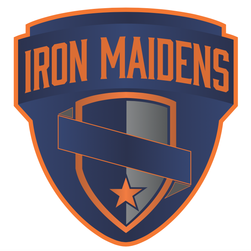
'Iron Maidens' was chosen as the text for its already very strong brand identity. The 'shield & ribbon' icon, that we know and love, has been kept but significantly simplified. This gives it a much stronger and bolder character, much like the roo and GGAFL bridge designs. It also allows for versatility, such when being printed or embroidered. The addition of a single star represents the attainment of a USAFL Division 1 title. |
Metro Teams
These have been left unchanged and, as always, the designs and brand is set by their team owners and leadership.
SF Footy
Out of scope for now, but expect to see some alignment to the new brand, with a fun, social, "we don't tackle because it hurts :(" twist.
We hope you like this new look and feel for the GGAFL, Iron Maidens and Roos! Look out for more updates—like an the assets and design guidelines for anyone who want's to create something. Team-wear and merchandise will be available soon!
- Julie 'Mama' Marks


